1. Branding and Usage Guidelines
The SBG logo is the *Trademark of School of Business and Governance. When displaying the SBG logo, please follow our standard branding guidelines. Other sizes and resolutions of the logo, some suitable for print, can be found on the logo download page.
Additional guidelines regarding the logo’s appearance are given below:
The Full Standard Colored Logo

The Full Standard Monotone Logo for Print

The Full Standard 2-tone Blue and White

The Full Standard 2-tone Black and White

The Condensed Standard Colored Logo

The Condensed Monotone Logo for Print

The Condensed 2-tone Blue and White

The Condensed 2-tone Black and White

1.2. Clear Space
There should be sufficient clear space around the logo.
1.3. Typeface
1.3.1. Complementary Font
We recommend using the Trajan Pro font for the “School of Business and Governance” and Microsoft Himalaya font for the “Ateneo de Davao University” as complementary fonts to the SBG Logo.
1.4. Color Palette
White – #fffff
Blue – #081478
Grey – #b6b6b6
2. Bad Logo Usage
2.1. Never Stray from the Color Palette

3. Improper Design Usage
3.1. Never Switch the Colors
Use a choice from the palette provided.

3.2. Never Use the Design on Similarly-Colored Backgrounds
Never use the design on similarly-colored backgrounds. Use a choice from the palette that is appropriate for the background.

3.3. Never Rearrange Elements of the Design
Do not change spacing, alignment, or relative locations of the design elements.


3.4. Never Stretch or Distort the Logo
Do not change the proportions of any of the design elements or the design itself. You may resize as needed but must retain all proportions.

3.5. Never Alter or Add Elements to the Logo
Do not add graphics, insert words, or modify the design elements or the logo/design itself.

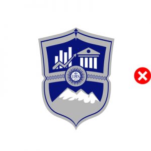
3.6. Never Use the SHIELD Only as the Logo
Use the condensed version with the School of Business and Governance – Ateneo de Davao University ring
4. For Print ads and Poster Usage
4.1. Place logo on a prominent area

4.2. Social Media and Webpage URL links (downloadable) must be placed on either of the lower corner of the poster/print ads depending on the layout.

Notes:
– The official downloadable media (desktop/mobile wallpapers) may contain some alterations to the design but it is released as official media with permission and therefore allowed
– Any individual or organizations violating the aforementioned guidelines will be called out
* Trademark/Patent Pending
__________________________________
I read and understood the branding guidelines. click here to proceed

